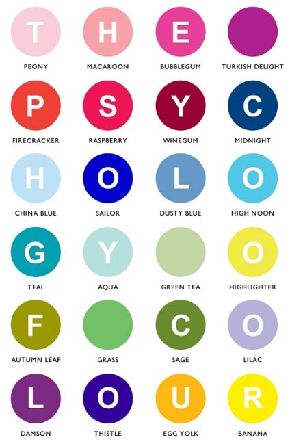
Numerous studies have sought to measure the effect colour has on our emotions and responses. The psychology of colour choice in marketing is a much-debated topic and many infographics on the subject can be found on all corners of the internet. However, the link between colour and response to a brand or marketing message is not as simple as a colourful infographic might lead you to believe. It is likely that our personal experiences, preferences and cultural upbringing will have a major effect on how we respond to given colours.
That being said, it is clear that colours do have an emotional impact on us and that companies spend a lot of time and money choosing the colours they want to represent their brand.
Here are some of the most popular colour choices and how they might influence us…
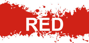
Associated with excitement and youthfulness. Red can be seen as bold and confident. It can also be used to create a sense of urgency and this is why it’s often used for sales, special offers and call to action buttons.
Example brands – Coca-Cola, Lego, Virgin, Nintendo
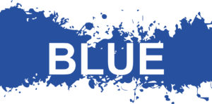
Symbolises trust and strength. It conveys a sense of dependability and trustworthiness. Blue is most often used by conservative and corporate brands.
Example brands – IBM, Facebook, Volkswagon, NASA
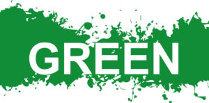
Associated with nature and health. It can convey a sense of peace and tranquillity. Green is favoured by brands who want to be seen as eco-friendly or aligned with nature.
Example brands – BP, Tropicana, Land Rover, Starbucks
Conveys an impression of wisdom, creativity and imagination. Brands also use purple to represent luxury or mystery. Some claim it stimulates the creative and problem-solving parts of the brain.
Example brands – Cadburys, Hallmark, Yahoo, FedEx
Associated with warmth and optimism. Yellow is used by brands who want to convey cheerfulness and happiness, although some argue that too much yellow can cause feelings of anxiety. Commonly used in shop windows to attract impulse buyers.
Example brands – McDonalds, Ikea, Yellow Pages, Chupa Chups
This is a friendly and confident colour. It can be thought of as combining the happiness of yellow with the impact of red. Orange is the choice of brands wanting to be seen as fun and energetic and it is likely to instil a sense of positivity and warmth.
Example brands – Fanta, Amazon, Firefox, Harley Davidson
Symbolises power, strength and authority. It can also be used by brands to convey sophistication and formality. Black is a good choice for high contrast and legibility, although overuse of black can lead to feelings of negativity.
Example Brands – Telegraph, Puma, Gillette, Wikipedia
![]()
At No-Minimum.co.uk we use the latest digital printing technology, so no matter what colour your brand uses you can be sure it will be faithfully reproduced on whichever printed product you select.
You might also notice that we’ve chosen blue for our logo. We hope this conveys our dependability and reliability!